Design a double-sided pole-mounted sign with an eye-catching maximalist aesthetic for Cute Nail Studio, a boutique salon in Austin, TX.
The Plan:
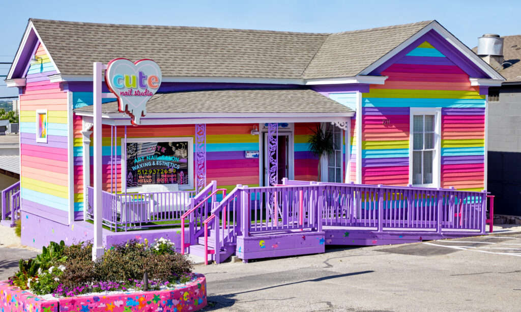
Adapt Cute’s logo into a dimensional sign that stands out against a colorful storefront in a visually eclectic neighborhood.
The Particulars:
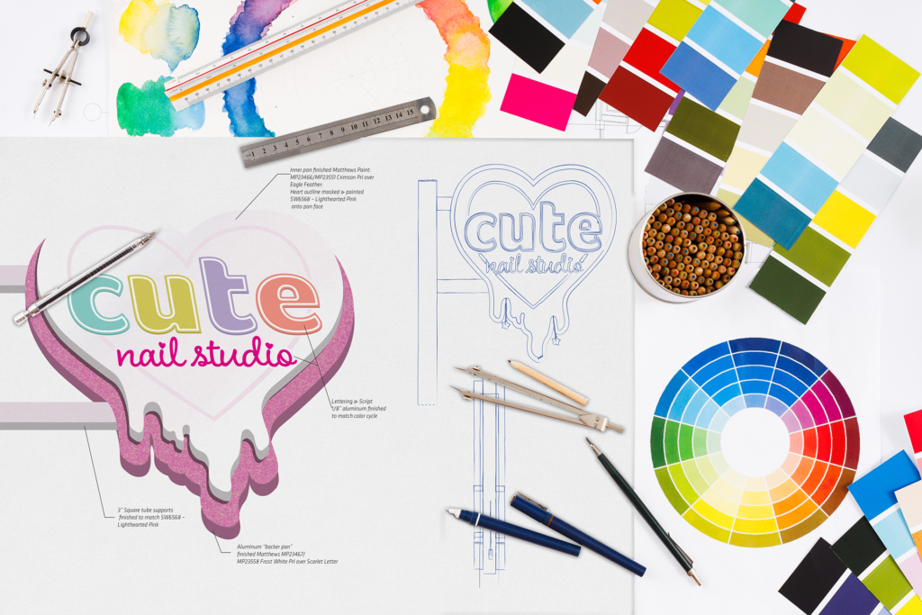
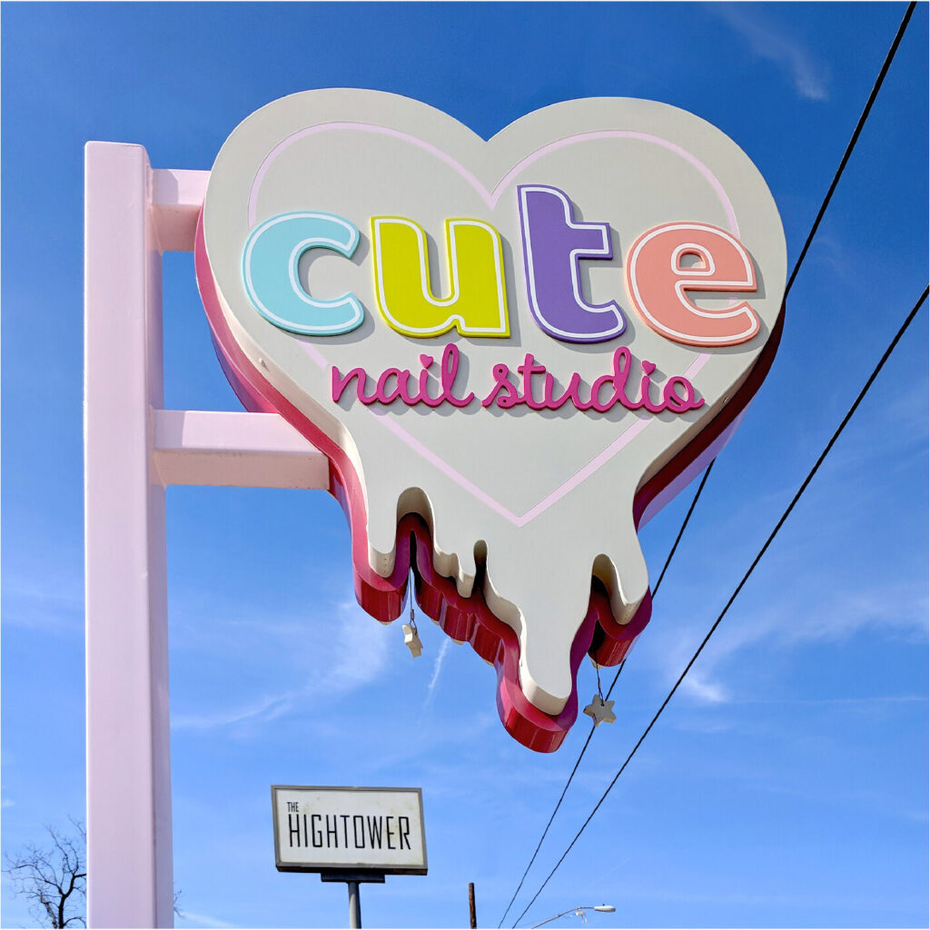
To create the sign cabinet, I adjusted the logo, exaggerating the drips and tweaking the proportions to ensure that everything looked good flipped- a necessity for a double-sided sign.
To balance the heavy square tubing our engineer called for, I developed three-inch deep tiers in the cabinet, giving the logo more depth without increasing cost or weight.
The sign was originally intended to be neon. When a last-minute construction change left us without power going to the sign, I instead used high-grade automotive finishes embedded with prismatic glitter chunks, popularized on race cars for their ability to sparkle and shine in natural light- a fitting compliment to the show-stopping gel and lacquer designs Cute specializes in.
Keep it cute.
Let’s keep it real- great nail art is the star of the show, but having a great backdrop for social shares never hurts either!
all photos & documents shown curtesy of Studio DZO.